Automatic data visualisation from CSVs and spreadsheets
How a six-stage prompt chain turned raw CSVs into shareable charts in August 2024 - the design decisions, the evals we built too late, and why the agents that killed it are the ones I'd build today.
A note before we start. I’m writing this in December 2025 about a product we built in August 2024, about a year and a half earlier. Model capability, agent harnesses, observability and reasoning have all moved a long way since, and so has how we design agentic systems and balance capability against cost and latency. I’ve written this as close as possible to the knowledge and tools we had at the time, because the important part is the design process: most of the foundational principles still hold when building production agentic systems today.
1. The Job
Most data work doesn’t start with a model. It starts with someone staring at a spreadsheet, trying to work out what they’re even looking at. I watched this for years: an analyst drops a CSV into Tableau, then loses half a day clicking through chart pickers, swapping axes, second-guessing what’s worth showing. The tools were never the problem. The hard part was deciding what to plot in the first place.
And the people stuck on that decision usually weren’t analysts at all. They were founders, marketers, ops leads - people with a CSV and no instinct for what a histogram tells you that a bar chart doesn’t. They didn’t want another chart-making tool. They wanted someone to look at the file and go here’s what’s interesting in this.
So that’s what we built. The bet was simple: the system should be able to spot the best trends in a dataset on its own. And you could put a number on it - do the analysis yourself, then count how many of your trends the system finds too. Using it took one step: upload a file. No prompt, no settings, nothing to configure. The system figures out what the data is, what matters in it, and hands back charts with plain-English explanations. It shipped in August 2024, and everything in the rest of this article happened in production, not in a notebook.
2. Is it agent shaped?
In August 2024 an “agent” was still basically what AutoGPT had made it: a loop - keep going until the model decides the job’s done. That’s still the core idea today - the harnesses around the loop have just got a lot smarter.
So the question was: should this be an agent or a workflow? Agents can do more, but they’re harder to watch and harder to test. Workflows are simple on purpose: fixed, discrete steps you can check at every stage. The price is rigidity. Our starting principle was to keep the system as simple as the problem allowed, so instead of asking “do we want an agent?”, we asked two product questions.
Q: How much control does the user need?
The whole point was the shortest possible path between uploading a file and getting charts back. We traded customisation for time-to-value, which meant the user had no way to steer a run at all.
A: Minimal.
Q: Do we know the steps the system runs, every single time?
Data analysis is surprisingly consistent. Before you can decide which trends to plot, you need context: what industry is this from? What’s in the file? What’s each column, and how much does it matter? That’s how a human analyst works, and we built the system to copy that process. And because the user couldn’t steer, we could hard-code the path: same steps, same order, every run.
A: Yes.
Minimal user control plus a known, repeatable path - that’s a workflow-shaped problem. Each step’s output feeds the next step’s input: a prompt chaining workflow, and that’s what we built. We knowingly traded latency for accuracy; we wanted the best possible charts and were happy to make the user wait for them. An agent would have bought us flexibility we had no use for, and priced in observability and evaluation pain we couldn’t afford.
3. Architecture
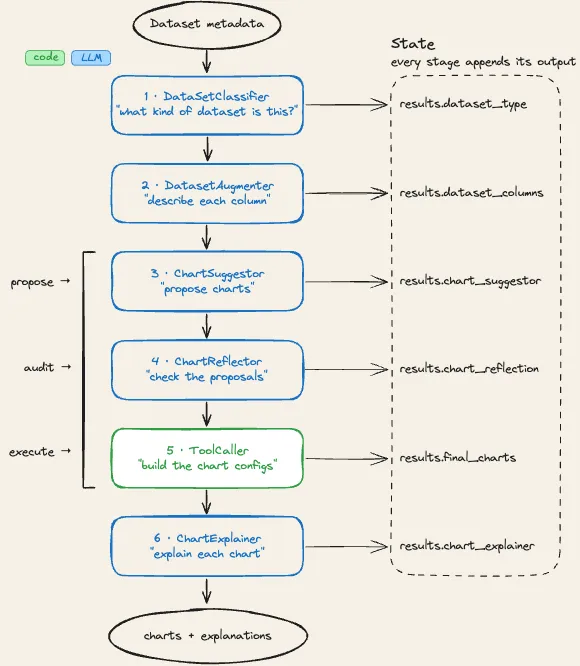
The system is a fixed prompt chain: six stages, no exceptions. The stages are modelled on how a human data analyst would approach a new, unknown dataset - work out what it is, understand each column, decide what’s worth plotting, check those decisions, build the charts, explain them. No planning step, no dynamic tool picking, no memory between runs. The intelligence lives inside each stage; everything around them is plain, deterministic Python. Five of the six stages are LLM calls. The one near the end, the stage that actually builds the charts, is just code. The LLM proposes and validates; deterministic code executes.
The thing holding the chain together is a shared state object that gets passed through every stage. Each stage reads what it needs, does its one job, and appends its output under its own key. Stages never talk to each other directly. And since nothing in this system is a chat (no stage ever writes free text back to the user), every LLM call is forced into structured output: each stage has its own Pydantic schema, the model generates JSON against it, and the validated result feeds the next stage’s prompt.
The input is worth a closer look, because the pipeline never sees the raw CSV. Before any LLM runs, deterministic code profiles the uploaded file and produces the description the models actually work from:
{
    "schema":      [{"name", "type", "unique_categories"}],  # every column
    "data_sample": {column: value},                          # one example row
    "row_count":   int,
    "categories":  {column: {category: count}},              # stats per categorical column
}
Everything the six stages will ever know about the user’s data is in that object. Each stage also fires an event when it finishes, which drove a live progress bar in the product - the user watches the analysis move step by step instead of staring at a spinner. Why six small stages instead of one big prompt, or two? Give an LLM one specific task and one specific schema and it does far better than one model juggling the whole analysis at once. So every stage was scoped tight, and every extra stage cost seconds of user waiting. The six stages:
DataSetClassifier. First, the system forms an opinion about what it’s looking at. It gets the schema, one sample row, and a preset list of dataset categories, and returns a category plus a one-line statement of what the dataset is for. That little bit of context (this is retail transaction data, it exists to track sales) goes into every prompt downstream.
DatasetAugmenter. Next, context at the column level: a one-line description of every column, written using the category and purpose from the stage before. A column called qty_2 means nothing on its own; it means a lot once the system knows it’s looking at warehouse inventory data.
ChartSuggestor. The generator. It proposes a set of charts: chart type, which columns go where, the aggregation to apply, and a title. It doesn’t choose freely - the prompt embeds a catalogue of ten chart types with hard rules about which column types each accepts, plus the five allowed aggregations, so generation is constrained up front rather than filtered after.
ChartReflector. A second LLM pass that audits the suggestor’s proposals against the same chart rules and the schema. It’s a critic, not a creator: it only outputs corrections for charts that break a rule, and an empty list means everything passed. Plain code merges the corrections back in.
ToolCaller. The only stage with no LLM in it. Pure Python takes each validated suggestion and builds the actual chart config: it re-checks in code that the columns exist and the aggregation is legal, maps the column names back to their originals, and assembles the final chart definition. Charts that fail these checks get dropped and counted, not repaired.
ChartExplainer. For every surviving chart, exactly five plain-English sentences: what the chart is for, the key insight, why this chart type, the business implication, and an actionable takeaway. This is where here’s what’s interesting in this gets said out loud.
4. Model Selection
Everything in this pipeline ran on Groq. Their whole pitch at the time was lightning-fast inference on open-source models, served very cheaply - the right platform for a chain where six calls run back to back and every stage’s inference time lands on the same user’s wait. It’s also what made it viable to bring the larger, more capable models into the chain at all.
With the platform picked, the model question wasn’t “which model is best?” It was “which stages deserve the expensive one?” The lazy answer is to throw the biggest model at everything; in a sequential chain that compounds against you. We asked one question of every stage: how much intelligence does this step actually need?
Two stages carried the product: the suggestor and the reflector. The suggestor decides which trends in a user’s dataset are worth showing at all - the whole bet lives or dies on that judgment - and the reflector has to catch its mistakes. Those two got the larger, more capable model: slower, but that’s where the judgment lived. The lighter stages got the smaller, faster one. Classifying a dataset against a preset list and writing one-line column descriptions are narrow, well-bounded jobs, and the small model handled them nearly as well for a fraction of the wait.
We also built everything from scratch: no orchestration framework, just direct calls to the Groq API, our own stage pattern, our own state object. In mid-2024 the frameworks were still young and opaque, and a fixed six-stage chain is, in the end, just a loop over stages with a state object. Owning that code outright meant we could debug every failure down to the exact line.
The catch with tiering is that model selection stops being a decision and becomes a practice. Every stage’s model choice has to be re-made as the landscape shifts - and it shifted non-stop for a year and a half; the pipeline today runs on models that didn’t exist when it launched. Per-stage routing is what made those swaps cheap: change a stage’s model, nothing else moves.
5. The System Around the Model
The stages were never the hard part. Most of the engineering went into everything wrapped around the LLM calls - what you’d now call the agent harness; in August 2024 it was just the pipeline code. Four decisions defined that system.
Nothing free-form ever leaves a stage. The first question a prompt chain has to answer: what happens when a call produces junk? If stage outputs are free text, every stage needs parsing code for the one before it, and every parse is a place to break. So we pushed the problem down into the inference layer: every call goes through a single client using instructor in JSON mode, and every stage declares a Pydantic response model. A response that doesn’t validate gets retried, with the validation error fed back to the model as an instruction to fix it (instructor’s retry pattern, capped). If it still doesn’t validate, that’s a failed call - not corrupted state flowing downstream. Every stage had its own contract; here’s what one looked like - the suggestor’s, trimmed:
from typing import Literal

ChartType = Literal[
    "bar_plot", "scatter_plot", "stacked_bar_plot",
    "heatmap", "wordcloud",          # ...10 chart types in total
]
Aggregation = Literal["count", "sum", "mean", "max", "min"]

class Chart(BaseModel):
    chart_id: int                    # ordered 1, 2, 3, ...
    chart_type: ChartType            # schema rejects anything off-list
    column1: str                     # slugified column names only
    column2: str | None              # only if the chart needs 2 columns
    column3: str | None              # only if the chart needs 3 columns
    aggregation: Aggregation | None
    title: str

class SuggestorResponseModel(BaseModel):
    reasoning: str                   # chain-of-thought, generated before any chart
    charts: list[Chart]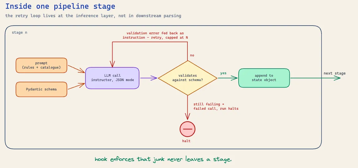
Notice the reasoning field sitting first. The suggestor and the reflector - and only those two - were prompted to produce a chain of thought before their output, and it sat at the top of their schemas on purpose: generated first, the reasoning tokens become part of the context the chart specs are generated against. The model argues its way through the dataset before it commits to a single chart. Keeping it to those two stages was a straight engineering call: chain-of-thought is extra tokens, and extra tokens are latency. The small-model stages existed to be fast, so they didn’t get it; the two carrying the judgment were given room to think.
“Generation” here means filling in that spec - not writing anything a user will read. The optional columns exist because each chart type eats a different shape of data: a wordcloud needs one column, a bar or scatter plot needs two (a category plus a value to aggregate against it), and the stacked variants and heatmap need three, the third being the column the series gets split by. Which columns a chart needs is purely a function of its type, so those rules travelled with the chart catalogue in the prompt. And notice chart_type and aggregation are Literals: the schema doesn’t just enforce the shape, it rejects any value that isn’t on the list before it ever leaves the inference layer. What a schema can’t express is the column-count rules - which column combinations are legal for which chart type - so those lived in the prompt and got re-checked in code downstream. Shape, legal values, and cross-field rules each got validated in the layer best equipped to do it.
Never trust the model alone. Chart creation is split across three stages on purpose: an LLM proposes (suggestor), a second LLM audits the proposals against the same explicit rules (reflector), and deterministic code re-validates everything again and builds the thing (the ToolCaller). In the pattern language that arrived later, the ToolCaller is the gate - the programmatic check between steps of a prompt chain - and the suggestor-reflector pair is an evaluator-optimizer run for a single pass. That final step can be plain code because of the structured output upstream: by the time a suggestion reaches the ToolCaller, the chart type, columns and aggregation are already validated fields in a schema, so building a chart is a dispatch, not a decision - read chart_type, look up its builder class in a registry, assemble the config. Every constraint you enforce upstream is an LLM call you don’t need downstream. We considered letting the reflector rewrite the whole chart list; instead it only outputs corrections, keyed by chart_id, because a small output gives the model less room to get things wrong and makes “everything passed” an empty list rather than a faithful copy. And the chart rules live in both prompts and get re-checked in code, because nothing in the system relies on the model respecting the rules. The cost was an extra LLM call of latency on every run. We paid it.
Protect the model from the world, and the world from the model. The pipeline never sees the raw dataset, only its metadata: schema, one sample row, row count, category stats - what you’d now call context engineering, giving the model the smallest set of high-signal tokens it needs and nothing else. Real user data also brings real user column names (spaces, unicode, quotes - things that break prompts and JSON alike), so every column name gets slugified before any model sees it, and the builder translates back to the originals. Identity gets the same treatment: models work with small ordinal chart_ids while code mints the real UUIDs, with an explicit mapping bridging the two. Ask a model to echo a UUID often enough and it’ll eventually mangle one. Never ask a model to be careful with something code can make safe.
Fail fast, and don’t loop. Every stage raises and halts the run on error, because everything downstream depends on its output being real - a half-true classification flowing on is worse than a stopped pipeline. And the system deliberately doesn’t loop at the semantic level: a chart whose spec breaks the rules gets dropped, not sent back for another go. The user gets one fewer chart instead of a slower, more complex pipeline. A dropped chart costs the user a little; a retry loop costs every user on every run.
The whole system, compressed:
| Stage | Job | Output contract | Model | CoT |
|---|---|---|---|---|
| DataSetClassifier | name the dataset’s domain | category + one-line purpose | small, fast | - |
| DatasetAugmenter | describe every column | one description per column | small, fast | - |
| ChartSuggestor | propose the charts | constrained chart specs | large, capable | yes |
| ChartReflector | audit the proposals | corrections only, by chart_id | large, capable | yes |
| ToolCaller | build the chart configs | chart components + ID mapping | - (code, no LLM) | - |
| ChartExplainer | explain each chart | five fixed sentences per chart | small, fast | - |
6. Evals
A quiet benefit of the prompt chain architecture is what it did to evaluation. Because every run went through the same steps in the same order, we could wrap evals around each step individually and check every stage against its own small contract. Evaluating the product stopped being one impossible question - “were the charts good?” - and became a set of small, answerable ones.
Honesty about scale before any detail: evaluation on this product was light, and late - every eval in this section was written after the pipeline it measures was already live. The reason is simple: we didn’t do eval-led system design. We built the system first and wrote the evals after, so the evals were always playing catch-up - measuring a pipeline that was already live instead of shaping it before it shipped. Of everything this project taught us, that’s one of the hardest-learnt lessons. But light isn’t none, and what we did run turned out to be early versions of patterns that now have names. Every eval below is built from one of three graders - deterministic code, an LLM judge, or a hand-written human reference - which is exactly the taxonomy (code-based, model-based, human) the field later settled on. And none of it ran on eval tooling - what existed was early, and we’d adopted none of it: we wrote the scoring statistics ourselves and built local Python dashboards to ingest the results and run the comparisons. Fully manual, end to end. Each eval below is tagged with the grader that ran it.
DataSetClassifier. Its contract is two fields: a category from the preset list, and a one-line purpose saying why the dataset exists. Both evals sat on the same foundation: a golden set of CSV files we labelled by hand, a category and a purpose statement for each.
- Classification accuracy. The simple one: run the golden set through the stage and check the predicted
categoryagainst the hand label. Deterministic, cheap, and it measured the failure that mattered most, because a wrong category tilted every stage downstream. Grader: code. - Purpose quality. A separate model call compared the generated
purposeagainst our hand-written reference and scored it 1 to 5. Kept deliberately simple: one number, one comparison, per file. Grader: LLM judge, against a human reference.- Anchoring the judge with few-shot examples. A 1-to-5 scale drifts - the judge’s idea of “good” changes over time - so the prompt carried worked examples of purposes, some good, some bad, each with its score. That pinned the scale to fixed exemplars instead of the model’s mood on the day.
- Chain-of-thought before the score. Reasoning models didn’t exist yet, so we prompted the judge to reason step by step before committing to a number. The scores got noticeably more reliable once the model had to argue its way to them first.
That chain-of-thought had to live somewhere, and since the judge was schema-constrained like everything else, it lived inside the schema. Every judge in this section shared the same response model: a reasoning field placed first, before the score.
class JudgeResponse(BaseModel):
    reasoning: str   # the argument, generated first
    score: int       # 1-5, generated conditioned on the argument
Same trick as the suggestor’s schema: the reasoning gets generated first, so the score comes out on top of it. Flip the order and the benefit inverts - the model commits to a score cold, then writes a justification for a decision it’s already made.
DatasetAugmenter. Its contract is a list of {column_name, description} pairs, exactly one per column. The same golden-set CSVs ran through this stage, and every description got scored on two dimensions:
- Column understanding. Binary: did the model get what this column actually is? A description of a
unit_pricecolumn that reads like a quantity fails, however well it’s written. Pass or fail, no scale. Grader: code - binary makes it a simple deterministic check. - Description quality. Does the description carry real information, or is it a thin restatement of the column name? Scored 1 to 5 by an LLM judge built the same way as the classifier’s: few-shot anchored with human-written examples, chain-of-thought before the number. Grader: LLM judge, against human examples.
The split mattered: a beautifully written description of the wrong thing is worse than a clumsy description of the right one, and a single blended score would have hidden exactly that difference.
ChartSuggestor. Its contract is the schema from section 5: a list of charts, each with a chart_id, a chart_type, up to three column assignments, an optional aggregation, and a title. Two evals ran against it:
- Chart validity. Did each proposal hold together as a chart - right columns in the right slots for that chart type, a legal aggregation, nothing pointing at a column that doesn’t exist? A
stacked_bar_plot, for example, has to arrive with three columns: a categorical for the x-axis, a numeric to aggregate with something legal likesumormean, and a second categorical to split the stacks by. Two columns, or asumover text, and it fails. Fully deterministic to check, since the rules are the same ones the builder enforces, and expressed as a rate: what fraction of proposals survive. Grader: code. - Trend coverage. For each golden-set file we did the analysis ourselves first, pulling out the main trends a good analyst would find. Then we counted how many of them the suggestor’s charts actually surfaced. Not “are these charts pretty” but “did the system find what we knew was there”, as a number. Grader: human - we did the matching ourselves.
That second eval was the whole product on trial. The bet in section 1 was that the system could figure out what’s worth showing in a user’s dataset; the matched-trend count was that bet, scored.
ChartReflector. Its contract is a list of corrections keyed by chart_id - only the charts that break a rule, an empty list meaning everything passed. Evaluating a critic needs something for it to catch, so we made the errors ourselves:
- Seeded-error catch rate. We took chart suggestions from the same golden datasets and corrupted some of them by hand - a wrong column type here, an illegal aggregation there. The reflector’s job was to find every planted error and fix it, measured as a rate: of the errors we seeded, how many did it catch? Grader: code - the seeded errors were known, so checking the catches is mechanical.
We built a critic; this eval measured whether the critic could actually see. A reflector that misses planted errors is an extra LLM call of latency dressed up as safety - this rate was the number that justified the stage’s place in the chain.
A quick aside on the ToolCaller: it never got an eval, and never needed one. It’s deterministic code - once the reflector’s done its job, the builder constructs each chart from its chart_type the same way every time. Deterministic code gets unit tests, not evals; the eval budget belongs where the non-determinism lives.
ChartExplainer. Its contract is five fixed sentences per surviving chart: purpose, key insight, why this chart type, business implication, actionable takeaway. One eval, on the same machinery as the rest:
- Explanation quality against a human reference. For the charts on the golden datasets we wrote the five sentences ourselves - a hand-crafted reference per chart. An LLM judge compared the generated explanations against ours, few-shot prompted with examples of what good looks like, and rated them 1 to 5. Grader: LLM judge, against a human reference.
The explainer earned its eval for a simple reason: it was the only stage whose output users had to take on faith. A chart, a user can squint at and check against their own data. A confident sentence claiming “revenue peaked in Q3 driven by the northeast region” - they’ll repeat that in a meeting. The charts carried the analysis; these five sentences carried the trust.
7. Observability
The capture side of observability was designed from the start; the consumption side was ad hoc.
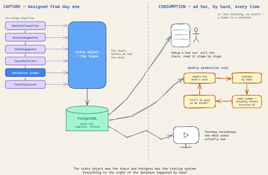
The designed half was the state object. Every stage appended its output to the state as it ran, and the whole thing got persisted to our PostgreSQL database - deliberately, for exactly this purpose. That gave us a complete record of every run: what the classifier decided, how the augmenter described the columns, which charts got proposed, what the reflector corrected, which charts the builder dropped, and the exact five sentences that went out to the user. The state object was the trace, and the database was the tracing system - we just didn’t have the words for it yet.
The ad hoc half was everything we did with that record. No live production tracking, no alerts - just manual extracts from the database, reshaped by hand and analysed offline in Python notebooks. Debugging a bad run meant pulling that run’s state and reading the pipeline’s work stage by stage, in a notebook, by a human. I’d have told you at the time this was a gap. It was half a gap: reading transcripts is the one observability practice that never stopped being current, and what we were actually missing was the tooling around the reading, not the reading itself.
There was also a visual layer: PostHog session recordings. A state row can tell you a chart was valid; it can’t tell you the chart looked terrible on screen. Watching recordings of real sessions was how we saw what users saw - and it caught the failures no schema check could express.
The most useful thing we built on top of this was a weekly production eval. Take a sample of the week’s runs from the stored state, reshape the data into the format the eval routines expected (manual work, every time), and run it back through the same evals from section 6 - the judges, the validity checks, the golden-set machinery, pointed at real traffic instead of the golden files. It was the closest thing we had to monitoring: not an alert that fired when something broke, but a weekly answer to the question “is the pipeline still as good as we think it is?” In today’s terms it was a regression suite pointed at production traffic: the golden-set evals measured what the pipeline could do, the weekly run measured whether it still could.
8. Failure Modes
All five failures in this section came from production - the most common and most costly ones we saw. They’re also where the evals came from: our golden sets and graders were reverse-engineered from failures like these, not written before launch. The wrong order, as I’ve already admitted - but it’s the order we actually lived, and it’s why this section reads like the test plan we should have started with.
The hardest one first: messy CSV files nearly broke the whole premise. The pipeline’s input contract was metadata - schema, a sample row, category statistics - which quietly assumes the file has a coherent columnar structure to describe. Real users upload exports with title rows above the headers, merged cells flattened into nonsense, half-empty columns, three tables stacked in one sheet. When the structure was off, the metadata was off, and the classifier and augmenter built the pipeline’s entire context on top of it. Nothing errored; the system just worked diligently on a description of a file that didn’t really exist. We struggled with this one, and the lesson cut deep: a pipeline built on metadata inherits every flaw in the metadata.
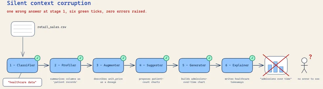
The silent one: misclassification. The classifier picked from a preset category list, and when it picked wrong, the mistake never raised an error - it just tilted every downstream prompt. The augmenter described columns through the wrong lens, the suggestor proposed charts for the wrong kind of dataset, and every stage completed green. We had put the pipeline’s most consequential context in the hands of its cheapest model. The rule it left behind: the earlier a stage sits in a chain, the more its errors compound, and the more scrutiny it deserves - however simple its task looks.
The classic one: the suggestor inventing columns that didn’t exist. Proposals would come back referencing column names the model had made up - plausible-sounding mashups of the real schema. This is exactly what the ToolCaller’s code-level checks existed for: the build failed, the chart got dropped, and the invented column never reached a user. The belt-and-braces design earned its keep here, but the failure still had a cost: it fed the silent-drop problem, with users getting fewer charts than the suggestor proposed. Validation catching a hallucination isn’t the same as the hallucination being free.
The subtle one: technically valid charts that were visually unreadable. The model would pick a categorical column with hundreds of unique values, and every rule would pass - right column type, legal aggregation - while the rendered chart was a wall of noise. The fix went into code, not prompts: when a category column blew past a threshold of unique values, the builders cut it to the top ten. “Valid” and “readable” are different tests, and only one of them can be delegated to a schema.
And the audience one: bar charts built from two numerical columns. Nothing in the type rules forbade it, but the result is effectively a histogram - a statistician’s chart. Our users were founders and ops leads who wanted simple charts they could drop straight into a deck, and a distribution plot answers a question they weren’t asking. The chart rules had encoded what was possible with the data, not what was appropriate for the reader. Correctness includes knowing who the chart is for.
9. Trade Offs
Every decision above had a price, and most of them were visible at the moment of choosing. These are the ones we knowingly paid.
Latency was the price of capability. Six sequential stages, including a reflector call that runs even when it finds nothing to correct, meant a run was never going to feel instant. The small models at the front of the chain got the first progress updates on screen within moments of upload, which is exactly when a user decides whether the wait is worth trusting. We judged that users would remember the quality of the charts and forgive the seconds.
Rigidity was the price of simplicity. The pre-defined path is the only path: whatever the dataset, it gets the same six stages and a choice from the same ten chart types. The system can’t rise to an unusual dataset the way an agent might; it also can’t wander off. In August 2024, with the tooling of the time, that was the right side of the bet.
Customisation was the price of time-to-value. When the system’s opinion of what mattered in a dataset differed from the user’s, they had no way to steer it. We asked users to trust the system’s judgment completely, which is a heavy ask, and it only holds as long as the judgment is good.
Fewer charts was the price of a single pass. A chart that failed validation was simply gone: a user might receive six charts where the suggestor proposed eight, with no account of the missing two.
We’d sign most of the same invoice again. The lines we wouldn’t are what section 10 is for.
10. What I’d Do Differently
Everything above was written from inside August 2024, judging each decision against what we knew and what the models could do at the time. This section is the one place I step out of that frame. A year and a half on, with better models, better tooling, and the scars from section 8, hindsight generates a long list - and most of it is noise: prompts I’d rewrite, thresholds I’d tune, names I’d change. I’ve kept it to the changes that would have made the product materially better, each one traceable to a gap this article has already admitted.
-
Eval strategy. Section 6 admitted the evals were light and late; here’s the full confession. We didn’t do eval-driven development; we did the exact reverse - built the pipeline, shipped it, then built the evals backwards from a system users were already touching. The cost was that we were permanently playing catch-up: an eval written after the failure it should have caught is a post-mortem, not a test, and ours spent their lives confirming what production had already taught us rather than warning us about what we didn’t know. Built again today, the order flips: every stage would get a properly scoped eval from day one - eval-driven development, as the practice is now called - designed across the same four surfaces: contract (did the output obey its schema and its rules?), quality (was it actually good?), consistency (does the stage agree with itself across runs?), and operational (what did it cost in time, money and retries?). The field has since grown vocabulary for the two we skipped: consistency is what pass^k measures - run the same task k times and demand it succeeds every time - and operational is the tracked-metrics block (tokens, latency, cost per task) that ships in every modern eval framework. What we actually ran covered slices of the first two surfaces for some of the stages; consistency and cost went largely unmeasured everywhere. The frustrating part in hindsight is how cheap the full grid would have been - a fixed chain of schema-bound stages is the easiest kind of LLM system to evaluate, because every stage already declares exactly what it owes. The architecture had done the hard part; we just never collected.
-
Defining what “good” looks like. The LLM judges scored against few-shot anchors, and the anchors did their job: they pinned the scale. What they never answered was the harder question underneath - what actually deserves a 5? We never sat down and defined, for each stage, what a genuinely good output looked like, so we had no way to be sure the judging standards meant the same thing from stage to stage, or even from week to week. Built again, that definition work would come first: written criteria for each stage’s output, agreed between us as humans before any judge saw them, and the judge checked against our own judgments until we trusted it. A judge is only as trustworthy as the definition of good it enforces, and we asked ours to enforce a definition we’d never written down.
-
The input boundary. The pipeline never actually processed data. We took the schema of the CSV, generated a chart specification against it, and handed the specification and the data to an interactive charting library to render. No code ever read the file, cleaned a column, or ran a statistic - the entire system rested on the assumption that the schema honestly described the data, and nothing existed to make that assumption true. That’s why messy files nearly broke the premise in section 8: intelligence downstream couldn’t recover structure that was never checked at the door. Built today, I wouldn’t rebuild the pipeline at all. I’d build a single agent with a code-execution tool and a small set of data skills - profile and clean a file, generate charts, assemble reports - so the agent writes and runs code against the actual data before a single chart is proposed. That dissolves both problems this architecture could never touch: the messy file gets inspected and repaired instead of trusted, and the locked-out user disappears, because a wrong chart becomes something you just ask the agent to fix. This is how the data-analysis agents that actually work today are built - which is also the honest coda to this product’s story: the arrival of agents built exactly this way is a large part of why this product didn’t survive. Section 2’s verdict wasn’t wrong; it was right about a moment. The system’s boundary was drawn where model capability ended in August 2024, and that line moved. And the eval strategy above doesn’t die with the pipeline: the four surfaces survive, they just attach to different units - tools and skills instead of stages, whole tasks instead of steps, with the same golden datasets as ground truth. What the agent gives up is the stage-level evaluability the workflow handed us for free. That price was unaffordable in 2024; today the tooling exists to pay it.